By Rikke Hammer (Master of Cultural Heritage Management student)
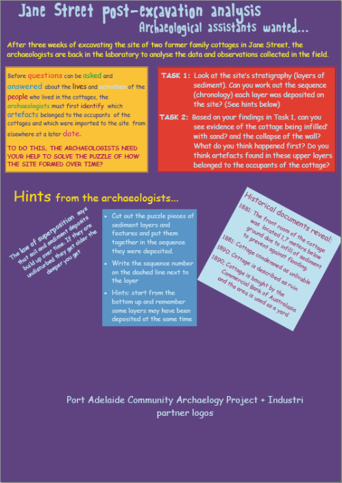
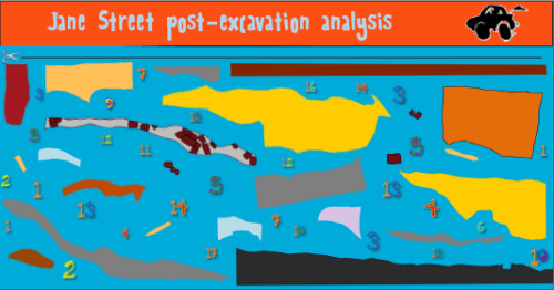
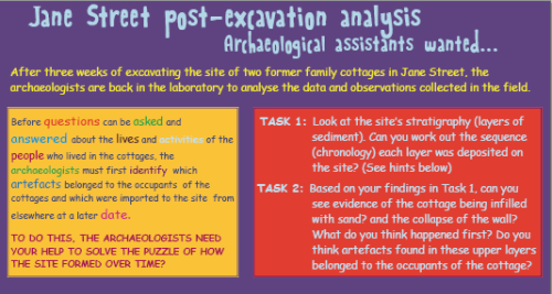
One component of my industry practicum with PhD student Adam Paterson involved producing interpretive materials for a public archaeology event held during the Port Festival on November 8 and 9 2011. Applying the principles of tiered communication and interactive presentation, I conceptionalized and designed two posters and one children’s activity brochure for use at the event.
HOW DO ARCHAEOLOGISTS READ THE SOIL ?
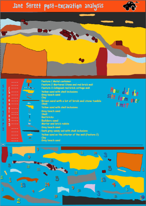
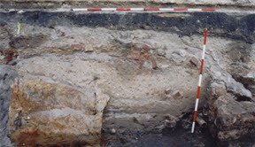
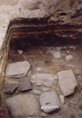
The first poster I created was to accompany and supplement a life size reconstruction of a section of the 2003 Port Adelaide Jane Street excavation trench. The poster had two main aims. First, to provide a brief introduction to the stratigraphic principles and methods used by archaeologists to decipher the past; and second, to engage the visitor by stimulating thoughts and questions about the depositional events that formed the Jane Street site over time and how identifying these events is critical to understanding the site’s history.
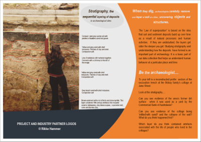
The poster makes use of the strong base colours of orange and cobalt blue and a lighter grey for eye-catching contrast. In addition, headlines in italic typeface and different sized text were used as attention grabbers. The main focus of the poster is a large scale photograph of a section of the Jane Street trench that largely corresponds to the area represented by the reconstructed section profile. Dashed lines and text describe the stratigraphy of the section, while the orange column to the right explains the law of superposition and asks questions that engage and demonstrate to the visitor how archaeologists read the soil to infer information about the past. The poster can stand on its own without further explanation or it can be used as supplementary information to the reconstructed section profile.
At the Port Festival event in Port Adelaide both the poster and the brochure operated at a further interpretive level, as the location of the public archaeology stand was at the site of the 2003 Jane Street excavation trench. Visitors were therefore able to directly relate the information from the interpretive materials to the buried landscape beneath their feet, thereby making the information more relevant to their here-and-now experience and contributing to a greater sense of place.
WHAT IS ARCHAEOLOGY?
The popular perception of archaeology is often linked with the recovery of megafaunal remains or influenced by media portrayals, such as the action-packed adventures and mysteries of ‘Indiana Jones’ and one-sided documentaries about golden treasures and lost civilizations. Another common, but too narrow, understanding of archaeology is that of excavation and of the archaeologist as an excavator. This issue was addressed with the second poster titled: “What is archaeology?”.
The conceptualization of the poster was loosely inspired by previous work by myself in a non-archaeological context and by the interpretive signage strategy at the Kings Reach tobacco plantation site in Maryland, USA. Also key to the design are the principles of tiered communication.
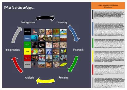
The three base colours, blue, orange and gray, used in the stratigraphy poster above were carried through to the ‘What is archaeology’ poster for aesthetic coherence. The interpretive content centers around six themes that convey archaeology as a logical process from the discovery of sites and objects through to their management. The integrated use of imagery, text and colour coding to convey the message was critical to the design philosophy of the poster. Each theme was assigned a colour for ease of navigation around the poster. For example, all information (pictorial or text) pertaining to the theme of fieldwork were indicated by the colour blue. The visitor then has two choices: to experience the story of each theme in pictures, horizontally, or to obtain more detailed information via the text. By colour coding the themes visitors are able to easily and selectively extract the level and depth of information they require for each theme.
The Jane Street archaeology stand at the Port Festival also displayed posters that informed visitors of the 2003 Jane Street excavation and about how artefacts recovered at the site have contributed a better understanding of the working class value of ‘respectability’ in the Port during the 19th century. These posters were produced by Adam Paterson. In addition, the ‘Take the Plunge’ team drew attention to their cause to get Australia to ratify the UNESCO 2001 Convention on the Protection of the Underwater Cultural Heritage through the display of a poster on the subject.

